News
Snapchat is testing a redesign to its app to simplify navigation
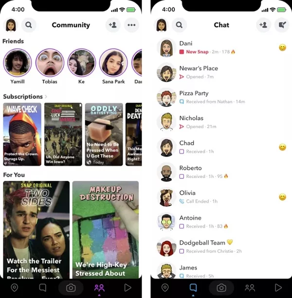
One of the first viral apps that we had in the last decade was Snapchat. This platform is still going strong right now and we see that the company is posting a huge earnings report too. However, we need to remember that the app is still quite a trouble when it comes to navigating. This is because the app’s snaps screen is okay as it does list all the people on the homepage. However, you have to swipe right twice in order to see stories from other people. And there is the option to swipe only since there are no tabs anywhere inside the app.
For this reason, we are now seeing that the company is testing a new layout to its app where the bottom navigation bar will be added. Also, there will be three to five separated sections and this navigation bar on the bottom will be black which might also be because of dark mode support coming soon. Now, we know that dark mode has arrived on WhatsApp beta so Snapchat should not be left behind in this dark mode race.
The navigation bar will make it easier to find the features inside Snapchat which are often used by people such as Snap Maps. Right now, we can get to snap maps with the bottom-up swipe from the main camera but it will now have its own navigation section. Apart from that, chats and communities will have their own sections. There will be a section for the camera to take snaps and the last section will be Discover where you can find people and connect with them.
While we can see that the look of each section will remain the same, the navigation has been simplified and we hope that the UI/UX of Snapchat changes soon too since it has been a long time since the redesign.
-

 Domains6 years ago
8 best domain flipping platforms
-

 Business6 years ago
8 Best Digital Marketing Books to Read in 2020
-

 How To's6 years ago
How to register for Amazon Affiliate program
-
 How To's6 years ago
How to submit your website’s sitemap to Google Search Console
-

 Domains5 years ago
New 18 end user domain name sales have taken place
-

 Business6 years ago
Best Work From Home Business Ideas
-

 How To's6 years ago
3 Best Strategies to Increase Your Profits With Google Ads
-

 Domains5 years ago
Crypto companies continue their venture to buy domains


