News
YouTube launches a new update for its Desktop and Tablet app layout
YouTube has always been one of the best platforms when it comes to content consumption. We have various platforms right now such as Netflix, Amazon Prime Video, Hulu and various others. But it is seen that YouTube remains the best as it is free, accessible to all and has a lot of content. Also, the fact that YouTube Creators are in millions helps the case for watching on YouTube rather than anything else. Now, YouTube has always been updating its apps in order to improve the experience for its audience.
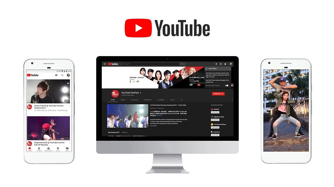
Similarly, we just have the report from YouTube regarding a new update that has been released by them. However, we should keep in mind that the update is only available for the Desktop and Tablet apps. This means that you will not see the updated UI on the YouTube website. Talking about the update, it is seen that the cards are now bigger which means that you get a lot more space for doing things. This is particularly useful on tablets where the content looks small and the touch area is also small.
With the new layout, however, you will see lesser thumbnails of content on a page as compared to earlier. From the 5×2 layout on its home screen for Desktop and Tablet apps, YouTube has now gone to the 4×2 layout. Therefore, you will now only see 8 thumbnails instead of the 10 full ones earlier but the experience will be better. Also, both the apps now have a “Add to Queue” button which is different from the “Watch Later” or “Add to List”. YouTube says that if you add videos to the Queue, they will disappear after the app is closed which means they are not permanent. Another “Don’t recommend channel” option has been added inside the apps so that you can mark it for any channels that you don’t like.
-

 Domains6 years ago
8 best domain flipping platforms
-

 Business5 years ago
8 Best Digital Marketing Books to Read in 2020
-

 How To's6 years ago
How to register for Amazon Affiliate program
-
 How To's6 years ago
How to submit your website’s sitemap to Google Search Console
-

 Domains5 years ago
New 18 end user domain name sales have taken place
-

 Business5 years ago
Best Work From Home Business Ideas
-

 How To's5 years ago
3 Best Strategies to Increase Your Profits With Google Ads
-

 Domains5 years ago
Crypto companies continue their venture to buy domains


