News
Blogger for Web finally gets a material theme refresh with responsive design
For those who are entering blogging or even trying to write their thoughts for the public, we have many of the free platforms that allow you to make a blog and write inside them. On the other hand, if you want more control over your blog then you need to have hosting, domain, and other things which are not be taken care of for a self-hosted blog. Talking about self-hosted ones, we have many such as Medium, Blogger, WordPress.com and others. While all of these have been great, Blogger was still having a very old design while the others had a modern look.
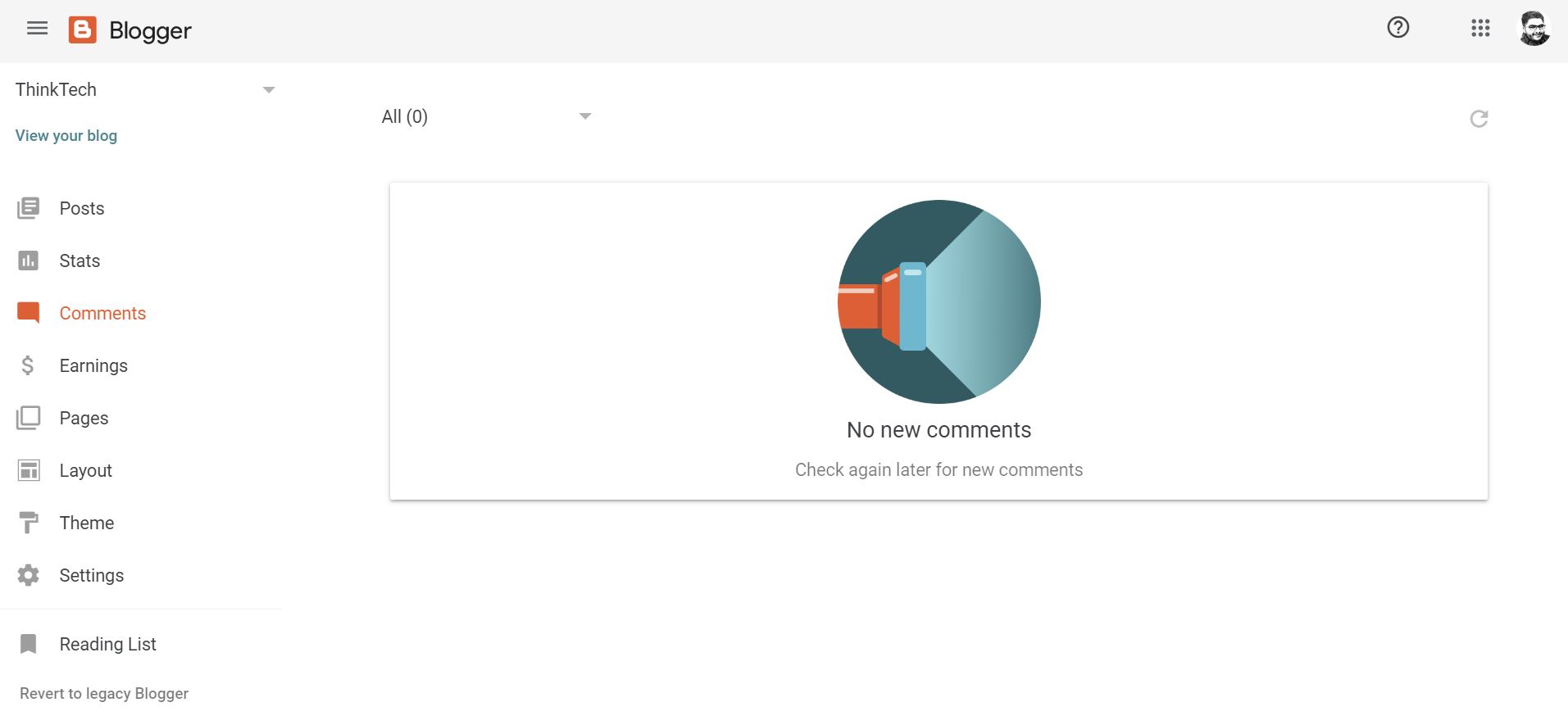
But that will change now as Blogger has also been revamped with a material theme refresh on the Web by Google. This is not totally surprising and tells you that Blogger is not dead because its Android app also got material theme redesign few months back. Now that the new material theme refresh in available for Blogger, it has also become responsive which it was not earlier. It is worth noting that the redesign is not a massive one by any means and is just a few tweaks here and there.
Having said that, it does make a difference of looking at the new one versus the old one. Google quietly announced the “improved web experience” for Blogger in May and that experience is rolling out now. The company also reveals that there are six “page-specific updates.” with the new design and they are basically increasing spacing and adopting to the material design guidelines in general. Also, the new Blogger is not available to everyone by default and you have to opt-in to “try new blogger” by clicking on a button in the left-side navigation bar. But it will become the default for all in July as per Google’s notice which will show up for everyone when they visit Blogger.com
-

 Domains6 years ago
8 best domain flipping platforms
-

 Business6 years ago
8 Best Digital Marketing Books to Read in 2020
-

 How To's6 years ago
How to register for Amazon Affiliate program
-
 How To's6 years ago
How to submit your website’s sitemap to Google Search Console
-

 Domains5 years ago
New 18 end user domain name sales have taken place
-

 Business6 years ago
Best Work From Home Business Ideas
-
 How To's6 years ago
3 Best Strategies to Increase Your Profits With Google Ads
-

 Domains5 years ago
Crypto companies continue their venture to buy domains


